
ELEVATOR SLIDES
What smooth jazz can tell us about the future of your presentation deck

My team’s decks came back faster this week. Noticeably faster. They were clean, structured, professionally assembled, the kind of output that used to take days arriving in hours. I should have been pleased.
I wasn’t entirely.
Every deck looked like every other deck. Not because my team had been lazy, or careless, or inattentive. They had used the tools available to them, and the tools had done exactly what tools do: optimized toward competence, toward polish, toward the acceptable center of what a professional presentation is supposed to look like. What I was staring at was the output of a system that had learned from thousands of decks and produced something statistically indistinguishable from all of them. Polished. Reasonable. Invisible.
This is when smooth jazz came to mind.

Smooth Jazz
Smooth jazz didn’t begin as a commercial calculation. Grover Washington Jr., who is generally credited with inventing it in the early 1970s, was a real musician responding to real musical instincts, fusing acoustic jazz with R&B and easy-listening structures because the combination felt right to him. The result was warm and accessible in a way that traditional jazz, with its appetite for complexity, dissonance, and improvisation, had never been designed to be. You didn’t need to understand why Coltrane’s chord substitutions were radical or what Miles Davis was doing with silence. You just had to be present.
Radio programmers understood immediately what that meant in revenue terms. After the Telecommunications Act of 1996 deregulated American radio and allowed conglomerates to acquire unlimited numbers of independent stations, smooth jazz became the defensible choice. Market research said audiences preferred it. Stations that had broadcast Monk and Mingus were converted, one after another, to something engineered specifically for palatability. The musicians who made that transition weren’t selling out, exactly. They were responding to a structural reorganization of the market, doing what the market rewarded, which is what rational actors do.
The cumulative result, though, was unmistakable. Improvisation disappeared. The unpredictability that makes jazz jazz, the moment when a musician goes somewhere the song wasn’t supposed to go, was systematically removed in favor of melody, groove, and the reliable comfort of knowing roughly where every track was heading. By the 1990s, you couldn’t tell one smooth jazz artist from another. The genre had optimized its way out of identity. “Hot tub jazz,” people called it. “Muzak-style.” Elevator music. Not because it was technically bad, but because it had become indistinguishable.
The interesting thing is that this had nothing to do with the talent of the musicians. It had everything to do with what happens when a production system selects relentlessly for broad appeal. You get something everyone can tolerate, and nobody remembers.

Corporate Memphis Got There First
Before AI presentation tools existed, this exact cycle ran through visual design.
From roughly 2017 to 2022, an illustration style called Corporate Memphis spread across the internet at a pace that was almost biological in its speed. Flat geometric shapes, vibrant primary colors, and elongated human figures with the effect of cheerful productivity. Facebook adopted it, and it was everywhere within months, appearing on startup websites, government communications, healthcare providers, subway advertisements, and the onboarding screens of apps you’d never heard of. The reasons were economic and obvious: the style was fast to produce, infinitely scalable, and available through stock libraries that anyone could access. WIRED eventually described it as a massive homogenization of the internet’s visual culture. The mocking names followed: “Globohomo,” meaning globalized homogenization. “Humanist Blandcore.” When everything looks the same, consumers lose the ability to tell what any of these companies is actually offering.
Corporate Memphis didn’t die because someone banned it. It died because the audience had become habituated to it completely, and it stopped doing the perceptual work that design is supposed to do. Companies pivoted toward 3D and glassmorphism not out of aesthetic preference but out of survival instinct.
The same force is now working on slides. The only difference is speed.
Volume and the Collapse of Variety
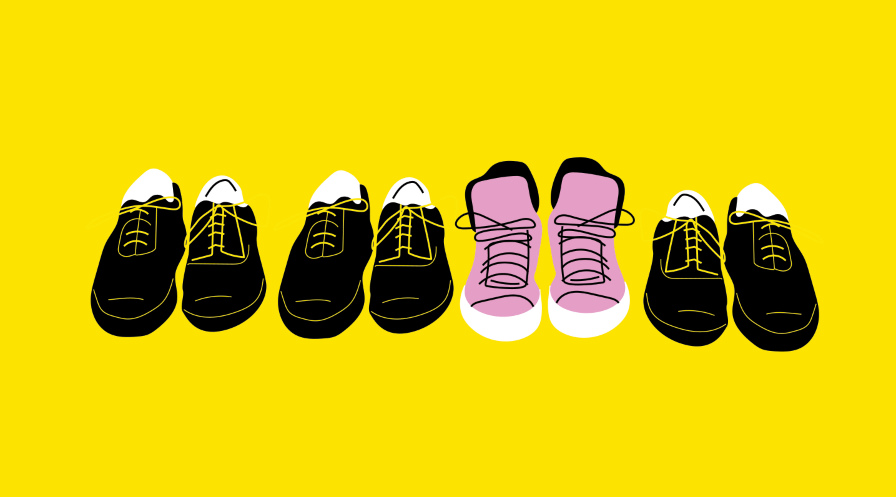
In 1933, a German psychiatrist and pediatrician named Hedwig von Restorff ran a set of memory experiments whose results are still foundational in cognitive psychology. She showed participants lists of categorically similar items that included a single distinctive one, and found that memory for the item that differed was significantly stronger than memory for everything around it. The isolated item didn’t just get noticed more, it got encoded differently, at a deeper level, because the brain treats deviation from context as information worth keeping.
The mechanism isn’t complicated. Human attention is a finite resource rationing system. In any uniform environment, the brain settles into a processing mode that treats repeated stimuli as background, something like the way a city-dweller stops hearing traffic. What breaks the pattern gets the resources. What blends in gets triaged.
You can express the attention problem with a simple ratio. Let D represent the distinctiveness of a given presentation, and N the total number of decks circulating in your attention market:
Attention Share ≈ D / N
Attention captured equals distinctiveness divided by volume. As N grows and AI tools pull D toward a shared constant, the ratio collapses. Every deck gets louder, together, and the net effect is silence.
How Memory Allocates Attention
The smooth jazz parallel closes the loop here. Those musicians were talented. The production was genuinely proficient. What the format had removed, systematically and deliberately, were the edges, the moments of friction, surprise, and deviation that the Von Restorff effect identifies as the thing memory actually grabs onto. Smooth jazz didn’t fail technically. It failed cognitively. It gave the brain no reason to pay attention.
There is also an older economic observation worth folding in. Gresham’s Law holds that bad currency drives out good when both circulate at face value. In a market for attention, the currency is distinctiveness. When an AI tool produces a deck that looks acceptable at a fraction of the time cost, that deck circulates at the same face value as one someone spent weeks refining. The floor becomes the standard, and the standard becomes the ceiling, and over time, the ceiling is all anyone can see.
Takeaway
Distinctiveness is not a stylistic preference. It is a cognitive prerequisite for being remembered. When AI tools push presentation design toward the statistical mean, they are not making ideas clearer, they are making them harder to retain, regardless of how good those ideas are. The Von Restorff effect is not a design principle; it is a description of how memory allocation works. A structurally average deck, however polished, competes with every other average deck for a share of recall that approaches zero as the category homogenizes.
Elevator Slides
Elevator music was never named for being bad. It was named for being functional, predictable, and impossible to hold onto. It filled a room without making a claim on your attention. It completed its job without making an impression.
Looking at those decks this week, I found myself thinking about the label that might eventually attach to this category of AI-produced slides. Not because they’re ugly, or structurally wrong, or made without effort. Because they are, in the precise sense that elevator music was, designed to be tolerable rather than memorable. They have the right spacing, the right hierarchy, and the right icon set from whichever default library the tool reached for. They communicate. They just don’t stick.
The end of the smooth jazz story is instructive and not entirely bleak. What survived the category’s collapse wasn’t better smooth jazz. It was musicians who had never stopped playing the harder version, keeping the improvisation, the complexity, the willingness to create exactly the kind of friction that makes an audience pay attention. They ended up in smaller rooms, to smaller audiences, but those audiences could tell them apart. That, increasingly, was the competitive advantage.
The decks that will be remembered next year will be the ones that look like someone made a decision. Not a default.
Takeaway
The problem is not speed, and it is not AI tools as such. It is what happens to any creative category when the floor of production quality rises uniformly and simultaneously for every participant. Smooth jazz lowered the barrier to entry, broadened the audience, and collapsed the category into background noise through indistinction. Elevator slides are the same dynamic, now running at the speed of a prompt. The question worth asking is whether your next deck sounds like a musician who stopped improvising, or one who never did.
STRATEX By Naz explores the behavioral, cognitive, and organizational forces shaping how people work and decide. Subscribe to receive new articles weekly.